11.3 The JTabbedPane Class
The
tabbed pane is now a fixture in applications for option displays,
system configuration displays, and other multiscreen UIs. In the AWT,
you have access to the
CardLayout layout manager, which can be used to
simulate the multiscreen behavior, but it contains nothing to
graphically activate screen switching—you must write that
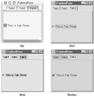
yourself. Figure 11-7 shows that with the
JTabbedPane, you can create your own tabbed pane,
with tab activation components, very quickly.
Here's the code that generated this simple
application. We use the tabbed pane as our real container and create
new tabs using the addTab( )
method. Note that each tab can contain exactly one component. As with
a CardLayout-managed container, you quite often
add a container as the one component on the tab. That way, you can
then add as many other components to the container as necessary.
// SimpleTab.java
// A quick test of the JTabbedPane component
//
import java.awt.*;
import java.util.*;
import java.awt.event.*;
import javax.swing.*;

public class SimpleTab extends JFrame {

  JTabbedPane jtp;

  public SimpleTab( ) {
    super("JTabbedPane");
    setSize(200, 200);
    Container contents = getContentPane( );
    jtp = new JTabbedPane( );
    jtp.addTab("Tab1", new JLabel("This is Tab One"));
    jtp.addTab("Tab2", new JButton("This is Tab Two"));
    jtp.addTab("Tab3", new JCheckBox("This is Tab Three"));
    contents.add(jtp);

    setDefaultCloseOperation(EXIT_ON_CLOSE);
    setVisible(true);
  }

  public static void main(String args[]) {
    new SimpleTab( );
  }
}
11.3.1 Constants
Two constants, shown in Table 11-9, were added in
SDK 1.4 for use with the new tabLayoutPolicy
property. See Table 11-9 for an example of these
constants in action.
Table 11-9. JTabbedPane constants
|
SCROLL_TAB_LAYOUT1.4
|
int
|
This policy restricts tabs to one row and provides a spinner to
access tabs by scrolling back and forth.
|
|
WRAP_TAB_LAYOUT1.4
|
int
|
This policy stacks tabs into multiple rows if they will not fit
cleanly on one row. This is the default behavior prior to the 1.4
release.
|
|
1.4since 1.4
|
11.3.2 Properties
The JTabbedPane class has the properties listed in
Table 11-10. For a tabbed pane, the properties are
much simpler than for the scrollpane. You have access to the
selection model (see Chapter 14 for a
discussion of SingleSelectionModel and
DefaultSingleSelectionModel), the currently
selected tab—available by component
(selectedComponent
) or index
(selectedIndex), and the total number of
tabs for this panel. The
tabRunCount
property tells you how many rows (or
runs) the pane is using currently to display all of the
tabCount tabs. You can also control the location
of the tabs using the
tabPlacement property, which can be
any of the TOP, BOTTOM,
LEFT, or RIGHT constants
defined in SwingConstants.
Table 11-10. JTabbedPane properties
|
accessibleContextb, o
|
AccessibleContext
|
·
|
|
|
JTabbedPane.AccessibleJTabbedPane( )
|
|
backgroundAti
|
Color
|
·
|
|
·
|
L&F-dependent
|
|
boundsAti
|
Rectangle
|
·
|
|
|
|
|
changeListeners1.4
|
ChangeListener[]
|
·
|
|
|
Empty array
|
|
componentAti
|
Component
|
·
|
|
·
|
|
|
disabledIconAti
|
Icon
|
·
|
|
·
|
|
|
displayed-MnemonicAtb, i, 1.4
|
int
|
·
|
|
·
|
-1
|
|
enabledAti
|
boolean
|
|
·
|
·
|
|
|
foregroundAti
|
Color
|
·
|
|
·
|
L&F-dependent
|
|
iconAti
|
Icon
|
·
|
|
·
|
|
|
mnemonicAtb, i, 1.4
|
int
|
·
|
|
·
|
0 (no mnemonic)
|
|
modelb
|
SingleSelectionModel
|
·
|
|
·
|
DefaultSingleSelectionModel( )
|
|
selectedComponent
|
Component
|
·
|
|
·
|
null
|
|
selectedIndex
|
int
|
·
|
|
·
|
-1
|
|
tabCount
|
int
|
·
|
|
|
0
|
|
tabLayoutPolicyb, 1.4
|
int
|
·
|
|
·
|
WRAP_TAB_LAYOUT
|
|
tabPlacementb
|
int
|
·
|
|
·
|
SwingConstants.TOP
|
|
tabRunCount
|
int
|
·
|
|
|
0
|
|
titleAtb, i
|
String
|
·
|
|
·
|
|
|
toolTipTextAti, 1.3
|
String
|
·
|
|
·
|
|
|
UI
|
TabbedPaneUI
|
·
|
|
·
|
null
|
|
UIClassIDo
|
String
|
|
|
|
"TabbedPaneUI"
|
|
1.3since 1.3, 1.4since 1.4, bbound, iindexed, ooverridden
See also properties from the JComponent class (Table 3-6).
|
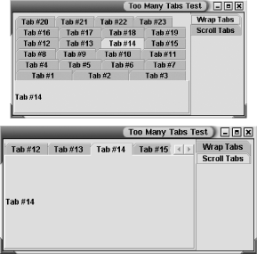
The tabLayoutPolicy,
added in SDK 1.4, allows you choose how to handle large numbers of
tabs on a pane. Figure 11-8 shows an example of the
two possibilities for this policy. (You'll find the
source
code for this example in the TooManyTabs.java
file for this chapter.) Also new with 1.4,
mnemonicAt and
displayedMnemonicAt add support for
mnemonics to the
tabs. The mnemonicAt property sets the actual
mnemonic for the tab. The displayedMnemonicAt
property provides a hint to the L&F as to which character should
be decorated in the tab. (For example, X is the
mnemonic, but you want the second
X underlined.) Note that not all
L&Fs support this feature.
11.3.3 Events
In addition to the property change
events generated for the model and
tabPlacement properties,
JTabbedPane also generates change events whenever
the tab selection changes. On its own, a
JTabbedPane listens to the change events coming
from the tabs to keep the user interface in sync with the selected
tab. Of course, you can add your own listener to the pane.
SingleSelectionModel uses the
ChangeEvent class to report a new tab selection.
- public void addChangeListener(ChangeListener l)
- public void removeChangeListener(ChangeListener l)
-
Add or remove a listener for change events from this tabbed pane.
- protected ChangeListener
createChangeListener( )
-
Create a listener that can route change events from the selection
model for the pane to the fireStateChanged( )
method. The protected inner class
JTabbedPane.ModelListener is used to accomplish
the redirection.
11.3.4 Constructors
- public JTabbedPane( )
-
Create an empty tabbed pane to which you can add new tabs with one of
the tab methods listed below. The tabs are placed along the top of
the pane.
- public JTabbedPane(int tabPlacement)
-
Create an empty tabbed pane to which you can add new tabs with one of
the tab methods listed below. The tabs are placed according to
tabPlacement—which can be one of
TOP, BOTTOM,
LEFT, or RIGHT—from the
SwingConstants interface.
- public JTabbedPane(int tabPlacement, int tabLayoutPolicy)
-
In 1.4 or later, create an empty tabbed pane to which you can add new
tabs with one of the tab methods listed below. The tabs are placed
according to tabPlacement—which can be one
of TOP, BOTTOM,
LEFT, or RIGHT—from the
SwingConstants interface. If there are too many
tabs to fit on one row, they will wrap or scroll according to the
tabLayoutPolicy.
11.3.5 Tab Methods
Once you have a
tabbed
pane set up, you can add, remove, and modify tabs at any time.
- public void addTab(String title, Component comp)
- public void addTab(String title, Icon tabIcon, Component comp)
- public void addTab(String title, Icon tabIcon, Component comp, String tip)
-
These methods allow you to add (append, really) a tab to the pane.
You must specify the tab's component
(comp) and title. If the
component is null, the tab still appears, but it
does not behave appropriately. When you select a tab with a
null component, the previously selected
tab's component remains visible. The title may be
null. Optionally, you can also specify an icon
(tabIcon) and a tooltip (tip)
for the tab. As with the title, null values for
these arguments do not cause any problems. Each of these methods
builds up an appropriate call to insertTab( ).
- public int indexAtLocation(int x, int y)
-
Added in SDK 1.4, this method returns the index of the tab that
contains the given coordinates (or -1 if no tab
contains them).
- public void insertTab(String title, Icon tabIcon, Component comp, String tip, int index)
-
This method does all of the work of getting tabs into place on the
pane. You specify the tab's title, icon, tooltip
(all of which can be null), component, and the
index to insert the component. If you supply an index larger than the
tab count, an ArrayIndexOutOfBoundsException is
thrown.
- public Component add(Component component)
- public Component add(String title, Component component)
- public Component add(Component component, int index)
- public void add(Component component, Object constraints)
- public void add(Component component, Object constraints, int index)
-
These methods are alternatives for adding tabs to a tabbed pane, in
case you don't want to use addTab( ) or insertTab( ). They are more in
keeping with the standard add( ) method for
containers. If you supply an index, the tab is
inserted at that index. If you supply constraints,
it should be either a String or an
Icon object for use in the tab. (If the
constraints object isn't a
String or an Icon, it is
ignored.) If you do not supply a title or constraint to label the
tab, the tabbed pane uses component.getName( ).
- public void remove(Component component)
-
Remove the tab with a match to component. If a
match cannot be found, nothing happens.
- public void removeAll( )
-
Remove all tabs from the tabbed pane.
- public void removeTabAt(int index)
-
This method allows you to remove a given tab. As with
insertTab( ), an inappropriate
index value causes an
ArrayIndexOutOfBoundsException.
- public int indexOfComponent(Component comp)
- public int indexOfTab(String title)
- public int indexOfTab(Icon icon)
-
These methods allow you to look up a tab at runtime. If you use the
second or third methods, the first tab with a matching
title or icon is returned.
11.3.6 Miscellaneous Methods
Tabbed panes also support the notion of
tooltips and do most
of the work for you. However, you do need to set the tooltip text
when you add the tab; no "setToolTipText( )" method exists.
- public String getToolTipText(MouseEvent event)
-
This method overrides the getToolTipText( ) call
from JComponent to return the tooltip appropriate
for the tab your mouse cursor is on.
Figure 11-9 shows our first tabbed pane with
tooltips active.
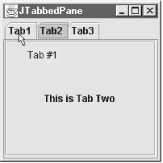
Here are the modifications to the code needed to make this work. We
just add a null icon and the tooltip text (the last arguments) to the
addTab( ) methods:
jtp = new JTabbedPane( );
jtp.addTab("Tab1", null, new JLabel("This is Tab One"), "Tab #1");
jtp.addTab("Tab2", null, new JButton("This is Tab Two"), "Tab #2");
jtp.addTab("Tab3", null, new JCheckBox("This is Tab Three"), "Tab #3");
contents.add(jtp);
You should also check out the example for the
BoxLayout class later in this chapter. It contains
a tabbed pane interface. One tab dynamically controls the
enabledAt property for each of the other tabs.

|