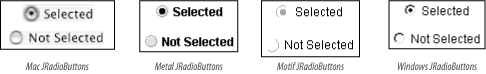
5.8 The JRadioButton Class
JRadioButton
is a subclass of JToggleButton, typically used
with other JRadioButtons, that allows users to
make a single selection from a set of options (Figure 5-8). Because radio buttons form a set of choices,
JRadioButtons are usually used in groups, managed
by a ButtonGroup (described in the next section).
If you specify an icon
for the radio button, you should also specify a selected icon so it
will be visually apparent if a button is selected.
5.8.1 Properties
The JRadioButton class inherits all its properties
and most of its default values from its superclass. The only
exceptions are shown in Table 5-14. By default, no
border
is painted on JRadioButtons, and their
horizontalAlignment is set to the leading edge (to
the left in the default locale, in which text reads left to
right).
Table 5-14. JRadioButton properties
|
accessibleContexto
|
AccessibleContext
|
·
|
|
|
JRadioButton.AccessibleJRadioButton( )
|
|
borderPaintedo
|
boolean
|
|
·
|
·
|
false
|
|
horizontalAlignmento
|
int
|
·
|
|
·
|
LEADING1.4
|
|
UIClassIDo
|
String
|
·
|
|
|
"RadioButtonUI"
|
|
1.4since 1.4, ooverridden
See also properties from JToggleButton (Table 5-10).
|
5.8.1.1 Events
See the discussion of JToggleButton
(JRadioButton's superclass)
events.
5.8.2 Constructors
- public JRadioButton( )
-
Create a button that has no text or icon and is not selected.
- public JRadioButton(Action a)
-
Create a button with property values taken from the specified
Action, register the Action to
receive ActionEvents fired by the button, and
register the button as a ChangeListener of the
Action. The button adapts to any future changes
made to the Action. The properties set are the
ones listed in Table 5-8, except that the
SMALL_ICON is not honored since
JRadioButton uses its icon
property to show its state. (This constructor was introduced with SDK
1.3.)
- public JRadioButton(Icon icon)
- public JRadioButton(Icon icon, boolean selected)
-
Create a button that displays the specified icon.
If included, the boolean parameter determines the
initial selection state of the button.
- public JRadioButton(String text)
- public JRadioButton(String text, boolean selected)
-
Create a button that displays the specified text.
If included, the boolean parameter determines the
initial selection state of the button.
- public JRadioButton(String text, Icon icon)
- public JRadioButton(String text, Icon icon, boolean selected)
-
Create a button that displays the specified text
and icon. If included, the
boolean parameter determines the initial selection
state of the button.
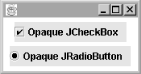
5.8.3 Opaque JRadioButtons and JCheckBoxes
Typically, JRadioButtons and
JCheckBoxes should be left
transparent (not
opaque) with their
contentAreaFilled property set to
false. These components usually fill only some of
their allocated space, and making them opaque or filled causes an
awkward-looking rectangle to be painted behind them, as shown
in Figure 5-9.
|